Inspired: Pearl Dive


 Good design lies in the details.
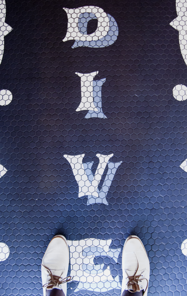
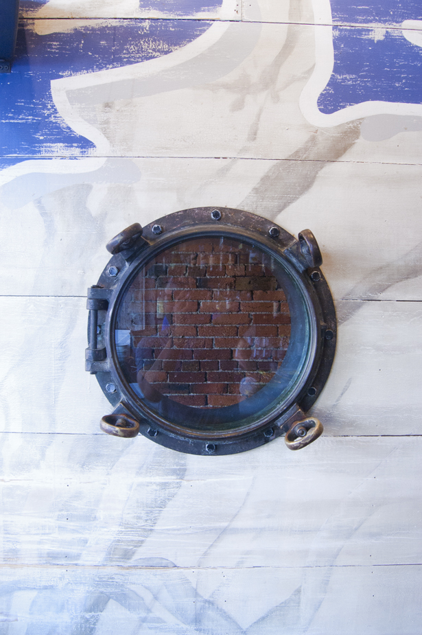
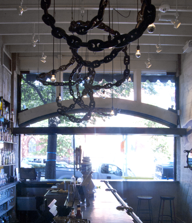
Truer words were never spoken about Pearl Dive; whose brand relies on maritime-inspired surfaces, cool blues, and some excellent uses of typography to tell it's story. Pearl Dive is connected to Black Jack (they're both owned by Black Restaurant Group), which I featured here last week. Some friends put me on to both of the spaces, and I'm glad that they did!
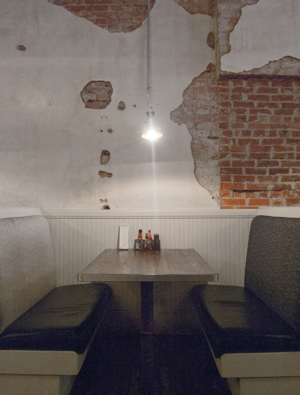
As a graphic designer, a good logo used in interesting ways always tends to catch my eye. Both the tiled wordmark and the wall mural pictured above are prime examples. The worn textures and whitewashed patina visible throughout the space makes it feel like Pearl Dive has been a 14th Street staple for decades, when it's only a few years old. It's a casual and approachable brand, but the food feels pretty upscale; their clam po' boy is probablyyyy the best that I've ever tasted.
