Inspired: El Centro D.F.


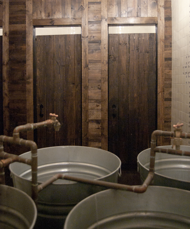
 Located in the heart of Georgetown (and with another location close to U Street), the authentically inspiring El Centro D.F. showcases an aesthetic that ties the brand directly to it's Mexican-inspired menu. Richly dark woods and exposed brick walls contrast against other raw materials to create a truly inspiring space. Now, exposed wood beams and brick walls aren't exactly novel concepts in the world of hospitality design these days, but it's so refreshing to see a space like this one that utilizes those elements in a way that makes you feel transported to a different time and place. The space definitely has a darker vibe to it, but it's lightened up through the use of skylights and and an open floor plan.
I'm digging the repeated display of skulls throughout the restaurant, usually in the form of wall murals, that are reminiscent of Día de Muertos. You already know that I'm a sucker for a brand's logo being used in interesting ways, so I love seeing it implemented here as the mouth of a skull, as you can see in one of the above photos. You also already know that I'm a sucker for amazing food, which El Centro showcases in bounds!
