Inspired: Black Jack
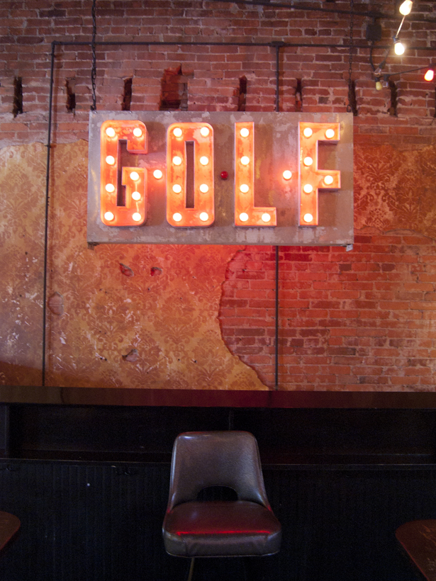
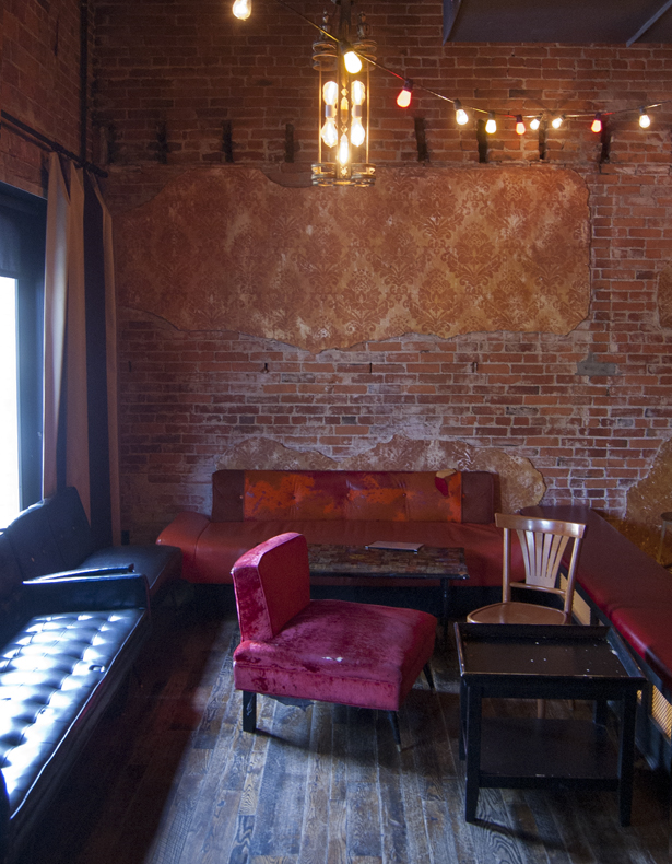
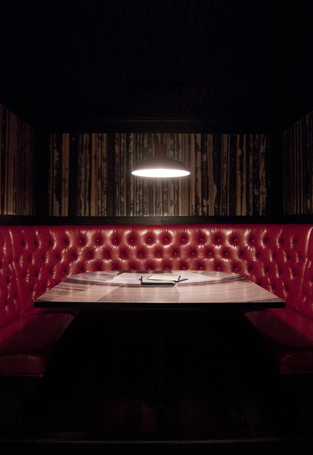
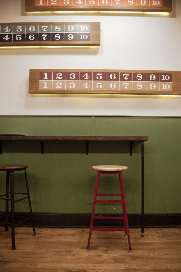
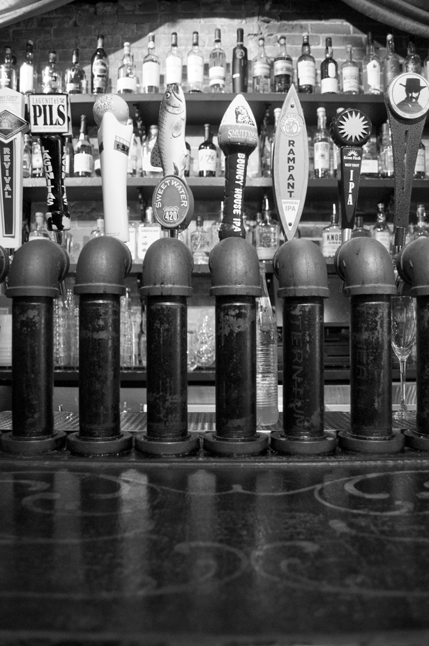 Salvaged materials, rich colors, and moody vibes all pretty much sum up the brand of Black Jack. Reflecting the craft cocktail movement that it represents, Black Jack's style harks back to an old school speakeasy, complete with dim lighting and luxuriously rich (but perfectly worn) textures throughout the space. AND there are indoor bocce courts, if the drinks and ambience aren't enough to draw you in.
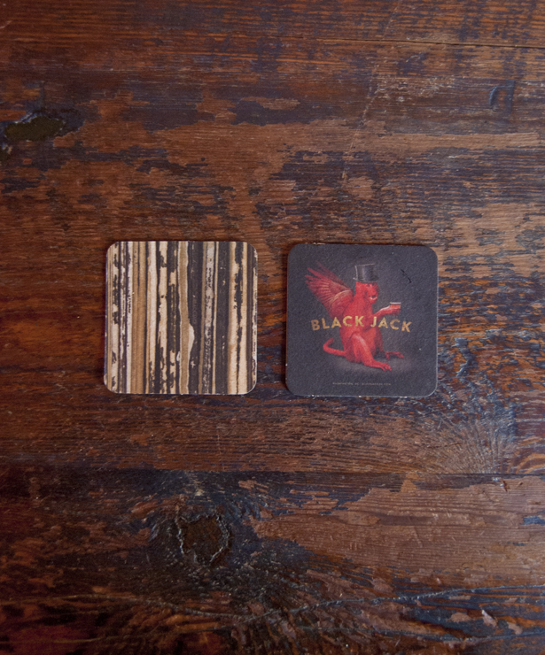
I sat down with E. Jay, the bar manager of Black Jack, to talk a little more about the brand and how it's reflected in the way the interior is designed. He walked me through the space to show how reliant the design is on reclaimed materials, such as the "GOLF'" signage, old tufted furniture, and old pipes used for the beer taps. We also talked about repeated elements of the brand throughout the space, as you can see in the custom wallpaper that's also used on coasters. The angry monkey on the other side of the coaster is repeated as a crazy mural in the space as well, but my photography skills failed me when it came to shooting it, unfortunately... Check out the restaurant to see it in person!
It's been a while since I've published an Inspired post! Life has been hectic for the past few weeks, so I've had to move some priorities around a bit, but I have a full slate of fun things to show and discuss over the summer! Stay tuned!
