
Inspired: Not Your Average Joe's
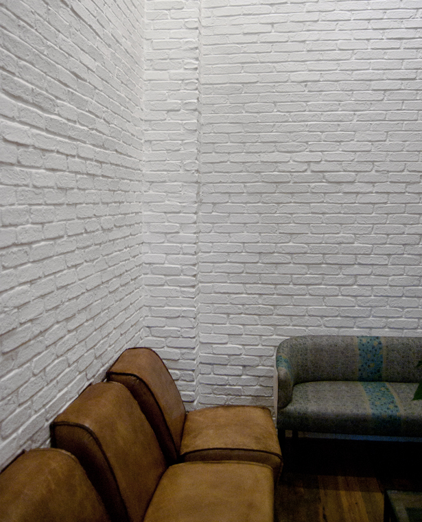
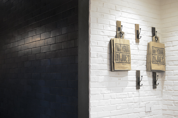


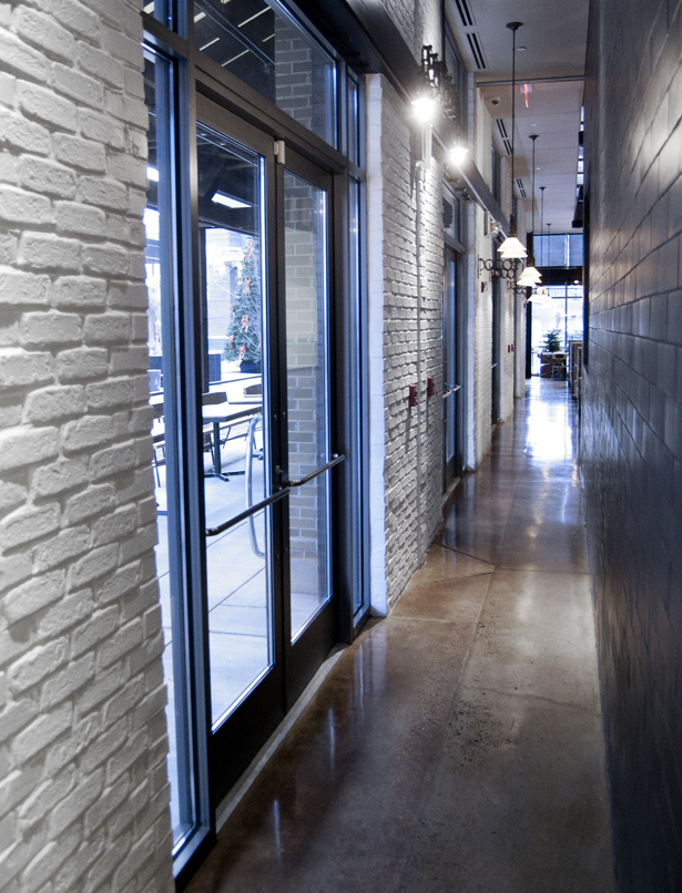
I love walking into an unfamiliar environment and being blown away by an awesome, cohesive, and interesting branding story. Such was the case when I stopped by Not Your Average Joe's in Woodbridge, VA on a cold afternoon to take a lunch break from Christmas shopping. The restaurant has a very cool visual identity, which is smartly set against elements of architectural contrast used throughout the space. I'm also a huge fan of the relatively vibrant toned furniture against the black and white brick, which is a pattern also reflected in the way bright iterations of the restaurant's logo (and variations of it) are juxtaposed against the neutral walls. Good ol' contrast done well.