Outdoor Spring Makeover with Target
It feels like we’re on the verge of awakening from a long hibernation.
With warmer weather right around the corner and as we HOPEFULLY begin to climb out of pandemictimez, we’re all looking forward to crawling out of quarantine, communing with our friends, and thawing out our social skills. HOWEVER, that momentous occasion hasn’t hit us quite yet, so why not treat ourselves to our own little oases at home? With some help from Target, that’s exactly what I did for my friend, Nick. As one of the biggest outdoor enthusiasts/social butterflies I know, quarantine was really starting to wear on him. As such, I helped him transform his patio into a place where he can work outdoors from home, sip on coffee or a cocktail, and get some fresh air in comfort and style.
Here is what Nick’s space looked like before I abruptly stepped in and took it over:
Potential, amirite?! I knew that this patio could be something special, and Target had the perfect springtime finds to make it so.
I wanted to create a space that would be an extension of Nick’s interior, which is inspired by interesting textures, a modernist approach, and hints of global decor. Here was the initial mood board that laid out the general vibe for the space:
Greenery
Can we get into this golden hour moment? Sheesh.
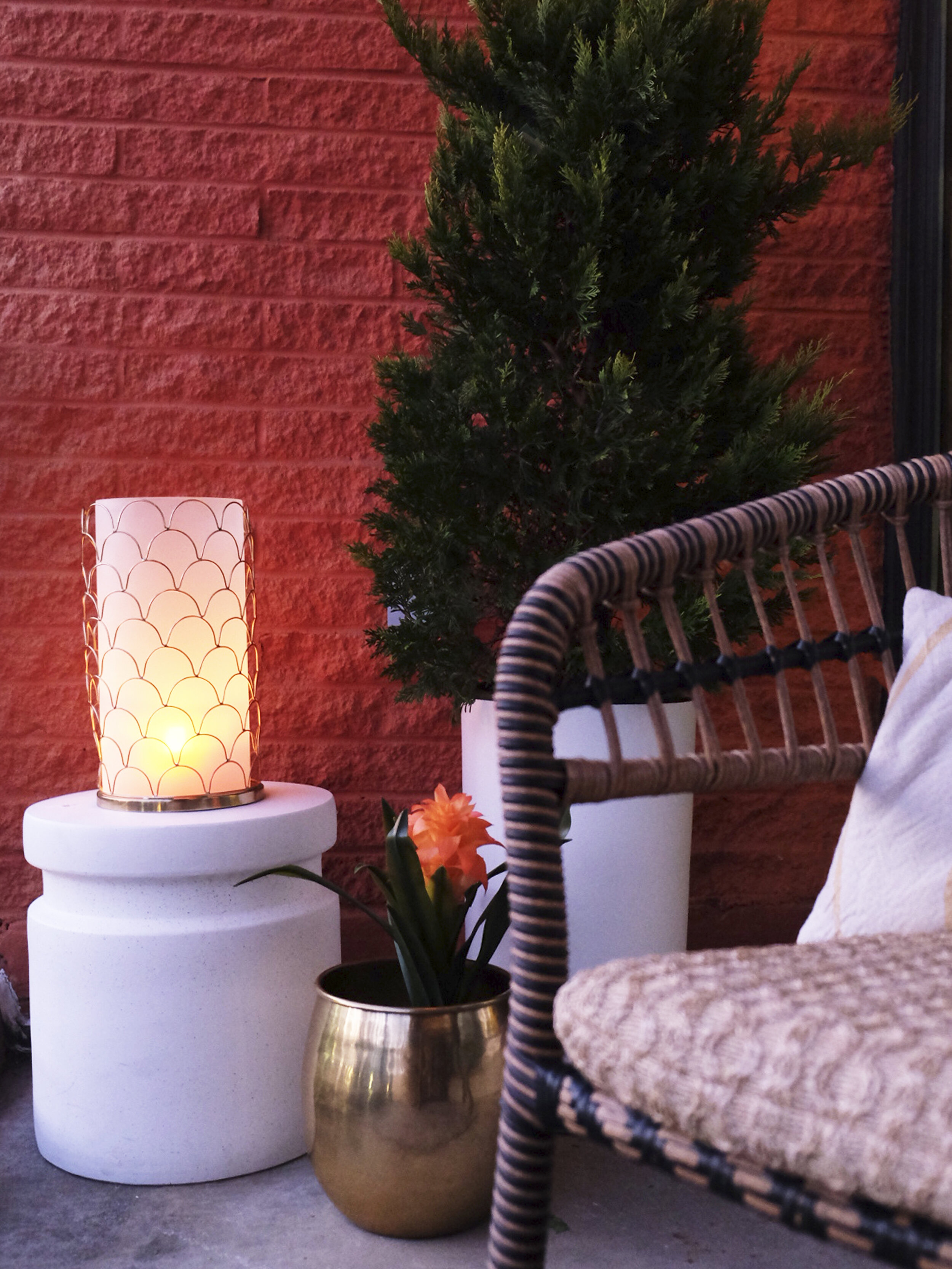
A huge component of this project was to bring greenery into the space that would be easy to maintain and make the space feel FULL and LUSH (queue “Lush Life” by Zara Larson). This large planter from Target’s Project 62 line made it easy to fill up the space pretty quickly (planters of this size usually cost well over $100, but at half the price, this one is surprisingly a steal)! Also, hanging planters help to pull focus upwards, which makes the space feel both taller and cozier.
If you’re like me and have only the SLIGHTEST green thumb—no fear! There is no shame in adorning an outdoor space with faux plants. This faux flower plant gives me exactly the right amount of color I was looking for, and it helps to make the space feel more full and cozy.
The seating area is flanked by two large plants, which makes the zone feel dedicated and intentional. The planter on the opposite side of the seating area feels distinct from the vessel on the other side, but they still speak each other’s language in a very cohesive way.
Textures and Layers
I’ve said it before and I’ll say it again, but in my opinion, the best way to make an outdoor space feel cozy and lived-in is to add layers of fabric, textiles, and textures. This patio set from the Opalhouse line at Target became the foundation for the design of the entire space. The texture that the chairs and table boast—both tangibly and visually—was the perfect jumping off point for additional layering and textiles. I added in seat cushions, a throw blanket, and a throw pillow to layer in some softness and to contrast against the harder texture of the chairs.
This fringe of this round throw pillow adds in a slight touch of whimsy to the space that juxtaposes nicely against the clean lines showcased elsewhere (Nick fondly refers to the pillow as “Susan”, I think). Also, this POUF! I love pieces that serve equal amounts of utilitarianism and style, and this pouf certainly doesn’t disappoint. It fits perfectly in this small space and is super soft and plushy. I also just love the word “pouf”. Speaking of utilitarianism, the woven basket in the background is a perfect place for Nick to store his bike pump and other outdoorsy accoutrement (HERE’S AN IDEA. A book that celebrates the intersection of beauty and pragmatism of outdoor spaces, called “Outdoorsy Accoutrement”. Doing it. Writing it.). Adding poufs and pillows was a great way to add texture and layers to the space in a pretty inexpensive/impermanent way.
Lighting
One thing that Nick felt pretty strongly about including in this makeover was mood lighting. In my mind, the obvious (and best) choice to accomplish mood lighting in an outdoor space is overhead string lights. These faux wicker string lights are the perfect nod to the wicker furniture below, and provide just the right amount of ambiance after the sun sets. Only regret: not buying more strands! I only bought one, and in hindsight, would totally recommend grabbing 2-4 strands for a space this size.
In addition to the string lights, I opted to adorn the space with these awesome lanterns to help set the mood. Their brassy, sculptural quality adds a personal touch of artistry that is reflected in the round pillow I mentioned earlier. These lanterns come in two sizes—the smaller size perfect for a surface, and the larger size perfect for the ground. When lit up with a candle, they add a warmth that you’d typically find on a romantic date on a beach during a beautiful sunset. …I might be projecting a little bit here, but you get what I’m saying.
And thus ends this spring refresh! Such a perfect little escape from a monotonous winter of quarantining, right? I love how this space fits Nick’s needs in a stylish, functional, and intentional way. If you’d like to shop this space, see below for links to everything!
A HUGE THANK YOU to Target and RewardStyle for making this makeover possible and for generally being a go-to source for homewares, furniture, and accessories for my entire life. Lova ya!


